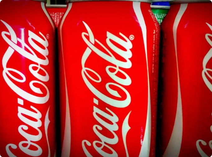
It started with a casual observation: “Have you noticed how the second ‘C’ in Coca-Cola looks like a smile?”
At first glance, you might shrug it off—just another case of overactive pattern-seeking. But then you look again. And suddenly, it’s impossible to unsee. That elegant curve in the second “C”—the one in “Cola”—does indeed arch like the gentle upturn of a contented grin. Once the idea takes hold, the entire logo seems to beam back at you: warm, inviting, almost alive.
This subtle detail has sparked fascination online, with many now describing the letterform as a quiet wink—a hidden gesture of friendliness embedded in one of the world’s most recognizable brands. But is this a brilliant piece of intentional design from over a century ago? Or is it a modern projection, shaped by our longing for meaning in familiar symbols?
What People Are Seeing
Take a close look at the classic Coca-Cola wordmark, rendered in its flowing Spencerian script. The letters glide with rhythmic grace—but it’s the second “C” that stands out. Its upper arc sweeps outward slightly farther than typical, then curls under in a soft, upward-facing arc. Tilt your head, and it’s not hard to imagine it as a smile: gentle, open, reassuring.
To many, it feels less like typography and more like a quiet hello—“I’m glad to see you.” Some even call it a covert wink, a secret shared between the brand and the viewer. Like seeing a face in the clouds or Jesus in a piece of toast, this interpretation thrives on pareidolia: the human tendency to find familiar shapes—especially faces—in abstract forms.
What History Actually Tells Us
The Coca-Cola logo was born in 1886, not by a branding agency, but by Frank Mason Robinson, a bookkeeper for the fledgling soda company. Tasked with naming the product and designing its label, he chose “Coca-Cola” for its euphonious rhythm and rendered it in Spencerian script—a graceful, looping handwriting style popular in 19th-century business correspondence.
At the time, this elegant cursive wasn’t a marketing ploy; it was simply the standard for formal writing. The curves and flourishes were aesthetic conventions, not coded emotional signals. The now-iconic red background? That didn’t appear until decades later. The “Dynamic Ribbon” swoosh? Not added until 1969.
Critically, no archival evidence—no memos, sketches, advertisements, or design notes—suggests Robinson or early Coca-Cola executives ever intended the second “C” to resemble a smile. There are no vintage ads that play on this idea, no internal documents hinting at “hidden joy” in the lettering. The logo was crafted for legibility and elegance, not psychological subtext.
So—Was It Intentional?
The honest answer: almost certainly not.
There is no credible historical proof that the “smiling C” was a deliberate design choice. The notion appears to be a modern reinterpretation, amplified by social media and our contemporary obsession with decoding hidden meanings in logos (remember the FedEx arrow? The Amazon smile?).
Yet that doesn’t make the perception any less real—or powerful.
Why the “Smile” Feels So Convincing
Even without intent, the interpretation resonates—and for good reason:
- Our brains are wired for faces.
Thanks to pareidolia, we instinctively read emotion into curves, lines, and shapes. A slight upward arc? That’s a smile. Two dots above a line? A face. It’s not delusion—it’s human nature. - It aligns perfectly with Coca-Cola’s brand identity.
For over a century, Coca-Cola has sold more than soda—it’s sold happiness. From “Open Happiness” to “Taste the Feeling,” its messaging consistently ties the drink to joy, connection, and nostalgia. So when we see a “smile” in the logo, it feels less like a stretch and more like the brand living its truth—even if unintentionally. - Classic designs evolve in meaning over time.
Great symbols don’t stay static. As culture shifts, so does our relationship with them. A 19th-century flourish can become a 21st-century emotional cue—not because the design changed, but because we did. The logo has absorbed decades of positive associations, and now, that second “C” feels like it’s smiling, because in a way, the brand itself has been smiling at us all along.
So… Is the Smile Really There?
Not by design—but yes, by perception.
And in the world of branding, perception is reality.
Whether it was placed there on purpose or not, the fact that millions now see warmth in that single curve speaks to the enduring power of Coca-Cola’s visual identity. It’s a testament to how deeply symbols can embed themselves in our collective consciousness—and how meaning can grow long after the ink has dried.
You might call it accidental genius. Or poetic coincidence. Or simply the magic that happens when a simple script meets a century of shared joy.
One thing’s for sure: once you see the smile… you’ll never see the logo the same way again.


